Considerations for Boomers being Boosted
Considerations for Boomers being Boosted

This article follows on from one from last month’s article reporting on excess mortality in Australia. I looked in detail at excess mortality in the age group 65-74, being the first narrow (10 year) age range, in the data available. Data for March 2022 is now out.
Excess mortality for all ages is showing worrying trends, remaining well above the baseline, even after accounting for COVID deaths.
I reported on the challenges I encountered because I couldn’t find a good set of data on COVID deaths, broken down by age, to adjust the all-cause deaths. One problem was age ranges in the COVID death data and mortality data not matching up. Government data is sometimes provided on web pages that get updated daily so you can’t get the history. I tried out the Wayback machine and alternatives and found issues there. To cut a long story short I have found a set of data on the COVID deaths that is usable. I’ll try to write up a separate post about this for those who are interested (this article became too long).
I have updated various graphs from the previous article. The conclusion is the same, ie that in this age group there was a significant increase in deaths in the first quarter of this year. However other insights have emerged.
It has become clear to me that boosting was in full swing, at this time, in Australia. I raise the question, could doing the boosting, while we were in the midst of an infection wave, have made things worse with respect to COVID infections?
These excess deaths require investigation. They can’t be swept under the carpet. We find out about them 3 months after they happen and I also make an argument for the need for real time health data. In engineering a control system measures the response of sensors in a system and uses this to update controls to make a system operate in a stable state. We are measuring responses at lag times too large to be useful and responding with the wrong output controls. It could be that we are in a world with a runaway control system. An analogy is a plane in descent and the sensor is telling you to pull up, but something is wrong and pulling the control lever makes the descent steeper. The result is a crash.
4th Booster Dose in Australia
From today (11 July 2022) in Australia a 4th injection is being offered for over 30’s. There was a time when Israel started booster doses a year ago (July 2021), due to ineffectiveness of the initial rounds, and it seemed a bizarre concept. Not anymore. For those following the pandemic closely you will know how weak the evidence is for any benefit of a 4th dose. Even Nature reports that it “provides little extra protection”.
When the 4th jab was offered in the US, Vinay Prasad, a Haematology, Oncology, Medicine Health Policy, Epidemiology, Associate Professor wrote on the subject. He pointed out the data offered in support of the 4th jab was weak. A close look at results showed improvements in the 4th dose group versus the 3 dose group that were occurring before any possible effect of the shot could be taking place. So all the study was showing was that there were differences in makeup of the groups being used. The people that ran out for the 4th jab were a different demographic. He states very strongly on the need for proper randomised clinical trials. He writes: In order to justify Pfizer’s billions & boosting huge chunks of the population, we need randomized trials. Pure and simple.
Dr John Campbell reported last week on the Excess Mortality being seen.
From the transcript:
Hundreds more people than usual are dying each week in England and Wales, not from Covid. Health experts call for urgent investigation. Amongst the reasons put forward, referencing a Prof Paul Hunter, University of East Anglia
Pandemic response
Lockdown and restrictions stress
Reduced physical activity
Lack of access to healthcare
Delayed referrals for diagnosis and treatment
Cost of living crisis
People whose health was / is weakened by COVID
Known increased risk of stroke and heart attacks
Vaccination
Increasing autoimmune disease
New medications used as covid treatments
I think the reality is going to be quite complex but it’s something we do need to be aware of and actually try and understand.
I would add one important item to this list above and that is medical errors due to a compromised health system, overly focused on COVID.
My Review of Excess Mortality in the 65-74 Age Group in Australia
The following graph (an update of one shown previously) shows the all-cause deaths from the start of 2019 (ie pre-pandemic) till March 2022 (red line) against the estimated baseline (blue line) based on the years 2015-2019. I repeat the baseline across each year to compare. This graph is not adjusted for COVID deaths. Excess deaths occur from 2021 onwards and the large increase in 2022 is influenced by the Omicron wave in Australia.
You can see above that years 2019 and 2020 do not indicate significant differences in deaths from the baseline and we therefore concentrate on 2021 onwards. COVID deaths, for all ages, from Jan 2021 are shown below (from Our World in Data) up till the current date.
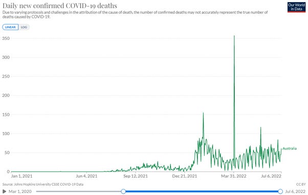
I’ve shown daily data here. The big spike, on April 1st, is approximately 300 deaths added based on a review in N.S.W. of death certificates. So these deaths really should be spread out backwards. This highlights a challenge with the data. A thought when looking at this again, was could this have been trying to account for the excess deaths authorities would have known were occurring? More thoughts on this later.
We don’t know how these one off extra deaths are distributed across age, but I found from a legacy news article: “Of the previously unreported deaths, 270 occurred this year, 58 in 2021 and three were deaths from 2020, in the first year of the pandemic”.
The following graph is the COVID deaths, weekly, for individual age groups, from the updated data source.
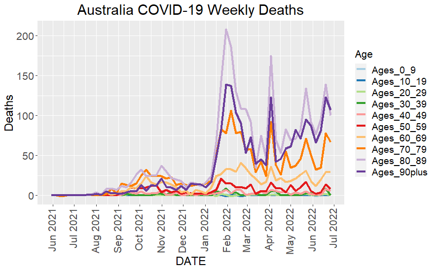
The one-off deaths addition, referred to above, is also seen as an artifact in the weekly data at the beginning of April 2022, in the graph above.
The Cumulative Excess Deaths from January 2021 onwards, showing the compensation for COVID deaths (orange line), is shown in the graph below.
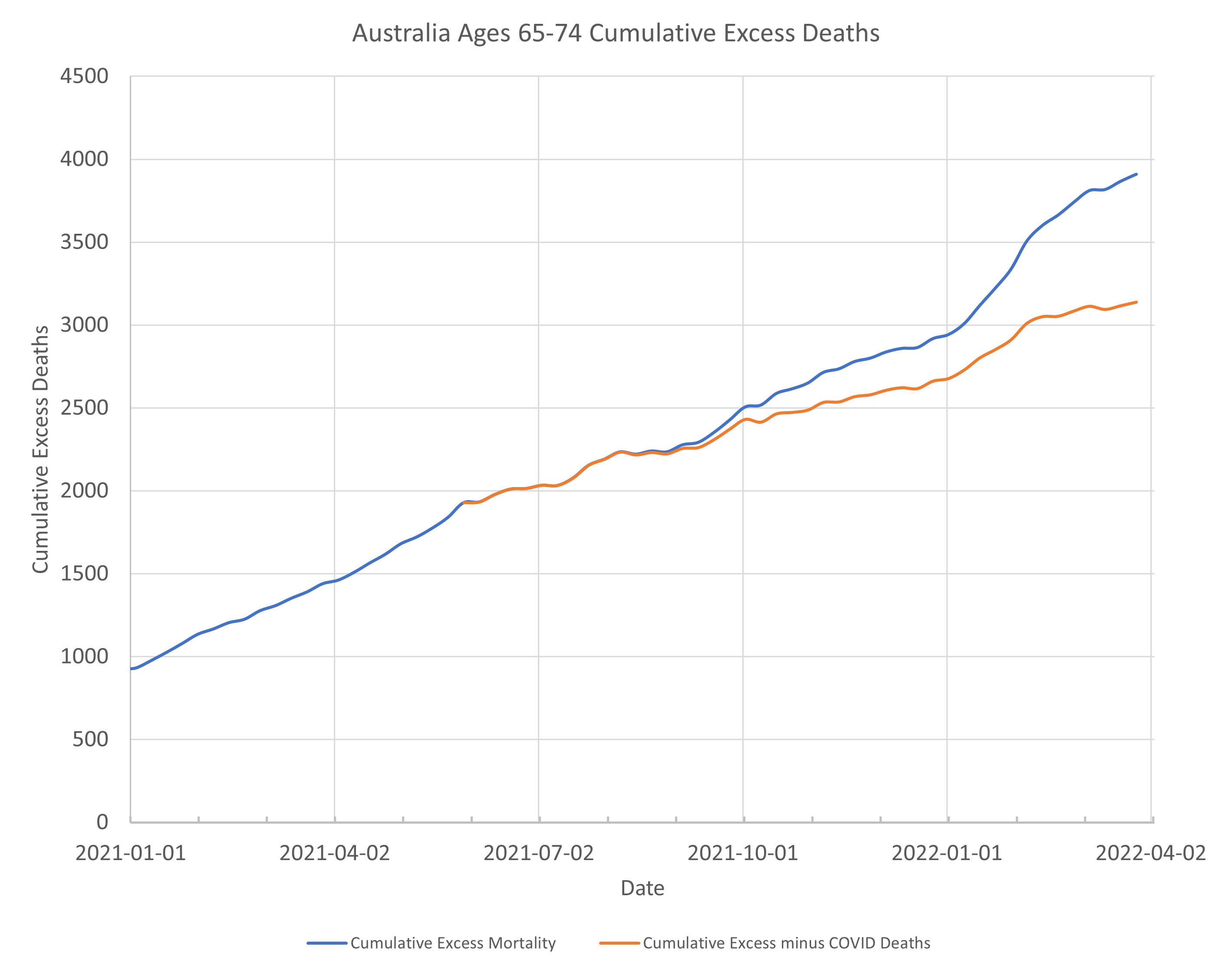
Note that the graph above is a Cumulative EXCESS Deaths curve (as opposed to the cumulative total deaths which will always go up over time). Cumulative Excess should ideally hover above and below zero. When the cumulative excess curve is getting bigger it means there are more and more deaths, not expected.
In the previous article I looked at the slope of this curve to try to see where there were sudden increases in excess deaths. An updated version of this graph, now I have better COVID death data for this age range, is shown below.
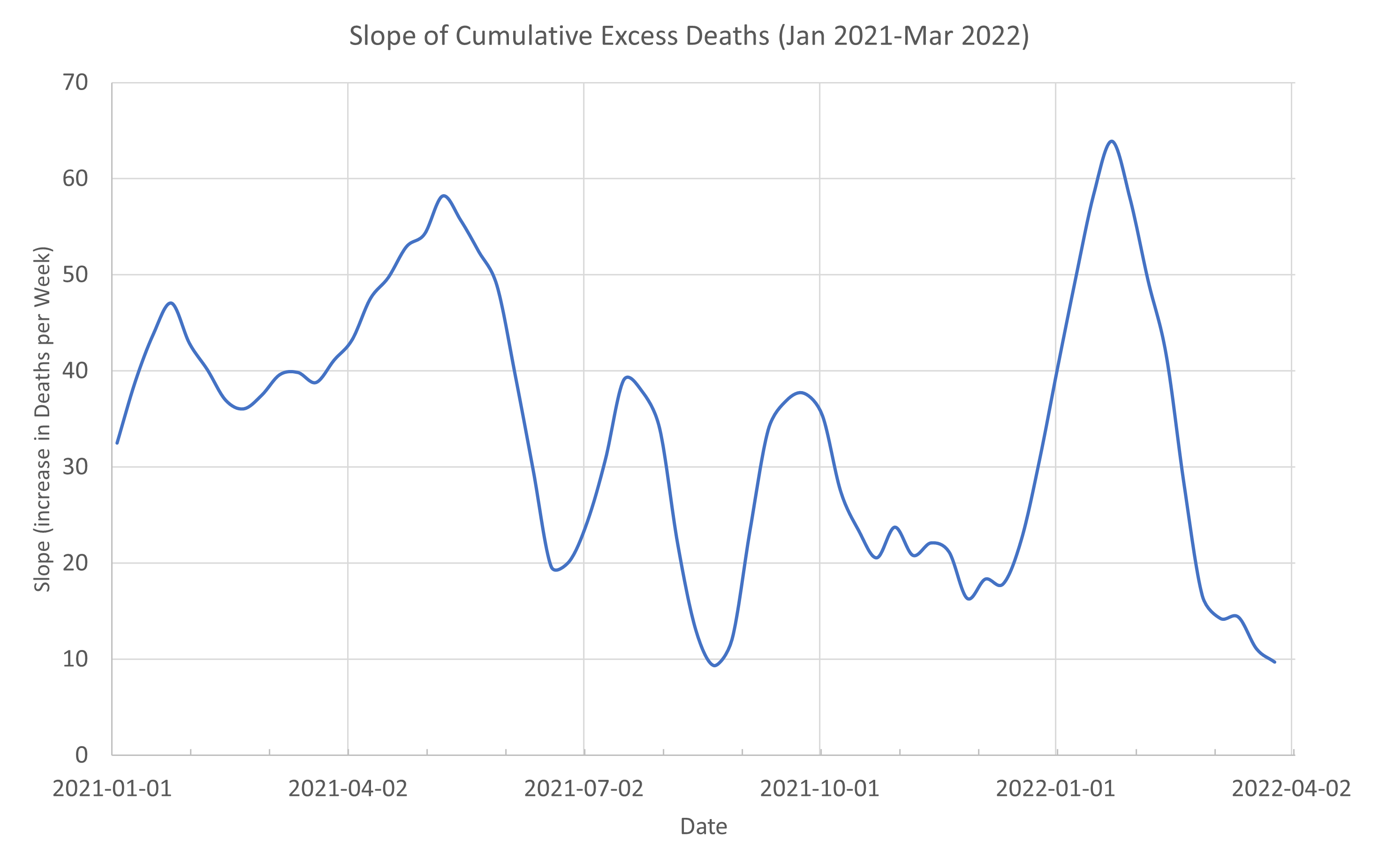
We now see a clear peak, at the right side of the graph. It is centred on the week ending 23 January 2022.
In the previous article I commented that a peak in the graph of slope, occurring around October 2021, would likely reduce if I took into account COVID deaths for that period, which I didn’t have at the time. And so it does.
The peak in all-cause deaths and also COVID deaths for this age group is the week ending 6 February 2022. The largest rate of increase of non-COVID excess deaths is therefore occurring just before this.
What was happening with the vaccination roll-out at this time?
I have found data for vaccination roll-out for different age groups. However there doesn’t seem to be age data available on third dose roll-out. Doses delivered versus date is shown below.
I calculated the slope of this curve and I have marked the location of the maximum rate of uptake with an orange marker.
Hmmm. It occurs at roughly 6th of February.
So, we were max boosting at the time when things were worst. Maximum COVID, maximum non-COVID excess deaths. Was this a good idea? Did anyone think about this? If some people were going to have artificially suppressed immune systems (temporarily due to boosting) at the time Omicron was rampant, was there a risk assessment done to consider what impact this might have?
Of course, the general public couldn’t do that. The data was not available till 3 months later. We have a BA4/5 wave now in Australia and 4th doses are rolling out. What will we see in the data for now in 3 months time?
To give another view of the excess deaths over this period I present the data another way below. In Australia over the months January-March the number of deaths occurring in the 65-74 age group are fairly flat. It’s our summer period. While we do comparisons to get excess mortality comparing the same week in different years, I figure there is really there is nothing special about a particular week.
Except maybe during holiday periods where people get family stress.
You can see in the first graph of this article, the type of variation that occurs week to week is of the order of 10’s of deaths. So, I look now at the deaths for each of the months January, February and March. I note one of these months has 5 weeks, but I have made each contain 4 weeks of data.
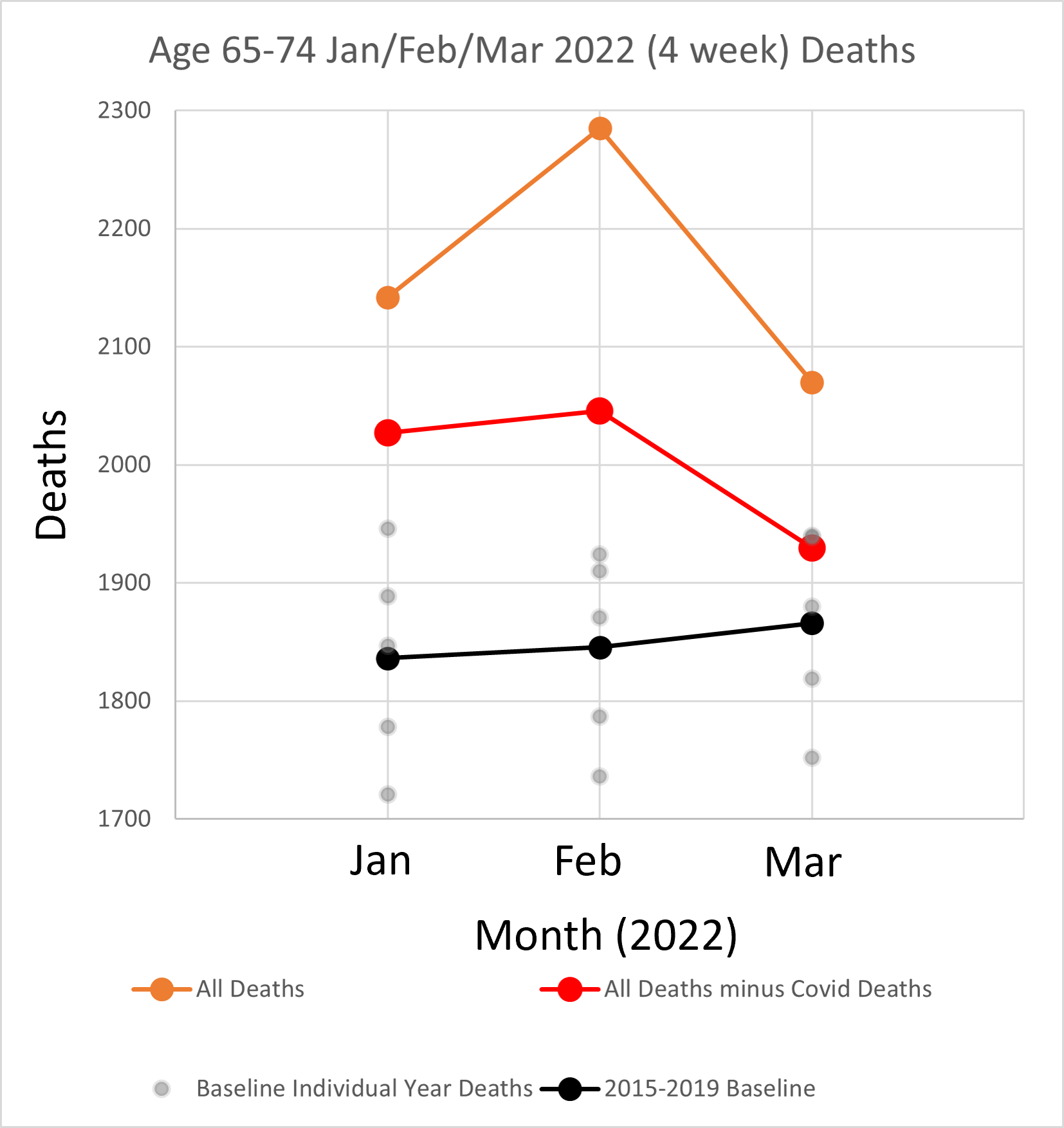
All-cause deaths (orange dots) are way above baseline (black dots) and to be clear I have shown, in grey dots, the deaths for the corresponding months making up the baseline for each month. The orange dots, which include COVID deaths, are all clearly above baseline and also above the maximum for any particular previous year contributing to the baseline. The deaths excluding COVID (red dots) are also all above the baseline. In one month, March, the deaths, taking into account COVID are approximately the same as the largest year contributing to the baseline.
The non-COVID excess deaths over the 3 months is 454. This is approximately 8% larger than the baseline.
Comments on the data
As noted above N.S.W. added extra COVID deaths (270) for this period but the contribution to the 65-74 group should be a small percentage of this if it is spread out across all ages.
We also know that many of the COVID deaths are deaths “with COVID” rather than “from COVID”. Dr John’s video shows this for UK data. The UK appears to be reporting this now, but not here in Australia. So in reality the deaths excluding COVID is probably higher than shown, making the real excess worse.
Of course, for some reason 2022 could just be an unlucky year and we should be comparing with the maximum of any of the previous years, but even then, we still have an excess. We also know that excess mortality, at a similar rate, is being seen in other Western countries following similar pandemic measures.
We can do a test to find if there is a “statistically significant” difference between the number of deaths between the two sets of deaths, ie for 2022 and 2015-2019. This is a bit rubbery because of the small number of samples but I calculated that it is significant (p value < 0.05 using the Welch t-test) and the 95% confidence interval does not cover that the possibility that there is no difference.
So it’s not good. By the way thank you for bearing with me up to this point. We are near the finish line for this article.
NSW Health Data
Let’s look at N.S.W. Health data for the bad week to see if we can get some further idea what is going on around this time. From the N.S.W. Surveillance reports for Weeks 5 (ends 5 Feb) and Week 4 (ends 29 Jan).
There is a table which shows age groups and proportion of cases with a severe outcome (ICU and or Death) amongst all cases, by age and vaccination status. I extract some of that data to the table below.
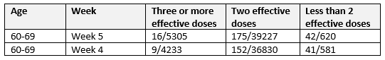
Looking at the report closely, this data is from a table that is cumulative from 27 November 2021. It has always suited authorities to reach back in time, as any benefit of injections gets worse over time. Data from the table is used to try to show that there is a larger proportion of bad outcomes (ICU and Death) for those not vaccinated. There is waffling text supporting the table.
By this point in time it had already become clear that the rate of infection is higher in those vaccinated, even with the small percentage not vaccinated. See my first Substack articles that started me on this journey of enlightenment – as Russell Brand would say.
The infections are the second number of the pair in each column. The less than 2 dose is approximately 1% of the infections. 2% of the population in this age group had less than 2 doses. So there is twice the rate of infection in the “fully” vaccinated.
However, the bad ICU/Death outcomes appear to be worse for the less than 2 dose group and in the original tables in the surveillance reports percentages are shown to make it clear to the stupid reader. This is where the sort of figures like unvaccinated people are 5 times more likely to die than if not vaccinated.
We can find what was going on for an actual week by subtracting numbers from successive weeks.
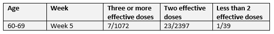
What? One ICU/death in the less than 2 doses for this week! 30 in the vaccinated groups! But I thought…
So the one ICU/death is 3%, but of course it is too small to be a good estimate.
How many of these are actual deaths? The national COVID deaths for the age group and neighbouring ages for this week is shown in table below.
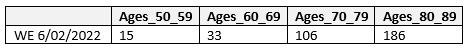
Because these age ranges don’t match the ABS mortality data, I have averaged adjacent ranges 60-69 and 70-79 for this work. I believe this gives me an overestimate of deaths, because there are so many more deaths in the higher age group, but it’s the best I can do for now, until we get more granular data. This gives 69.5 deaths for 65-74 age range.
The deaths only (ie excluding ICU) in NSW from another table in the Surveillance reports for ages 60-69 was 85 (week 5) - 68 (week 4) = 17 deaths. For ages 70-79 deaths were 208-167=41. There are roughly 3 times more deaths in the older group.
So what does this tell us? Out of the 31 ICU/Deaths for 60-69 there were 17 deaths. The majority of these deaths had at least 2 injections. There may have been no deaths in those with no injection.
Those in this age group are at least 10 years less than the median age of death and therefore not expected to die if in good health. Presumably those that unfortunately succumbed to COVID in this age group will have had underlying health conditions and this variable is likely more influential that vaccination status.
I suggest there are 3 sub-categories in the less than 2 dose group for this age group. There are those who elected not to take the jab in this age group who are robust healthy people, unlikely to die from COVID. There are those who may be ill and on many medications and have either been advised not to take the shot or had a bad reaction to the first shot. A second could finish them off. Then there are those who just had bad luck, were healthy, had one shot, and had a reaction due to the lipid nanoparticle going where it shouldn’t have, eg the heart. The cells in other organs are invaded by the nanoparticle causing them to sprout the spike protein, causing the cells in the wrong organ to get attacked by the body’s defence system. They therefore shouldn’t risk the second roll of the dice.
Effective?
Use of the term “effective” in the surveillance reports with 2 dose and 3 dose means at least 14 days after the jab and prior to being infected. So there could be many in the 2 dose group that have actually had the 3rd injection but are not 14 days out from injection. In fact it’s quite likely given the high rate of 3rd doses being given out at the time.
Using “less than 2 effective doses” as a single category is misleading because this includes those who only had one dose and those in the vulnerable period following injection.
I found data on vaccination rates for this age group at that time. For the 65-69 group nationally second dose percentage was 97.9% and 1st dose was 99%. Noting that they do not show above 99% but I checked the trend and it had only just reached 99 %, so it will be close.
I note that the people who only get one dose are clearly those who had a bad reaction to the first and could not take a second. With the severe mandates in Australia if you took one dose and not a second it means you had a really bad reaction. This one or so percent across age groups is the elephant in the room the authorities do not want to mention any more.
What did Geert tell us?
Virologist Geert Vanden Bossche warned from the start of the injection roll-out the dangers of vaccinating in the midst of a pandemic. This creates immune pressure on the virus to preference more infectious variants. We currently have BA.4 and BA.5 in Australia, called the variants for the boosted by Igor Chudov.

He bases this on looking at data from different countries.
I saw a legacy media article this week on a newly named variant “Centaurus” (BA.2.75) which has been detected in Australia. So we are even coming up with novel naming strategies for all the new variants.
While Geert’s warning seems obvious, my review of this data leads me to another warning.
We were boosting at the maximum rate right in the middle on the initial Omicron wave in Australia. Was this wise?
We know that after injection, for a period, the immune system is artificially suppressed as the body responds. That means that one is more likely to be infected during this period. Geert Vanden Bossche has used the analogy for vaccinating in the midst of a pandemic as being like a soldier running into battle and loading his rifle as he goes. The analogy may be even more apt here.
In the government data the term “effective dose” is used for a time 14 days (or longer in other countries) after the second injection, when one has supposed full protection. This has been used by health authorities to make unvaccinated categories look worse than reality because it includes than those in the period from first injection to 14 days after the second where people were potentially more prone to infection. The anomalies in the data from the UK has been shown by Professor Fenton’s group in the UK.
The effect was also seen in the recent child (6 month to 5 years) trial data where infections were worse in the injected group compared to uninjected group until at least 3 shots were given. See my previous article.
As I look at the data presented here I wonder what the proportion of people who recently had a 3rd injection are amongst the infections and deaths in the 65-74 year age group. There will certainly be some in the 2 effective dose group that had in fact had the third injection.
If there is one thing that I have learnt in data science work is that dodgy categorisation of data leads to erroneous conclusions and can have disastrous consequences in critical situations.
A number of deaths over this period could be due to acute adverse reaction to the injection. Total deaths reported on the TGA Adverse Event database, DAENS, since rollout, as of today, is 894.
DAENS, reports 14 deaths between 24 Jan and 20 Feb (ie a period bracketing the peak of the deaths). It is very difficult to work with the DAENS. I have to do further digging to identify the individual deaths to find what ages these deaths were. There is a way to do it, a story for another day. Two serious adverse event reports, a cardiac arrest in a 72 year old male and cardiac failure in a 66 year old female, from this period are shown below (noting they may not have necessarily resulted in death).
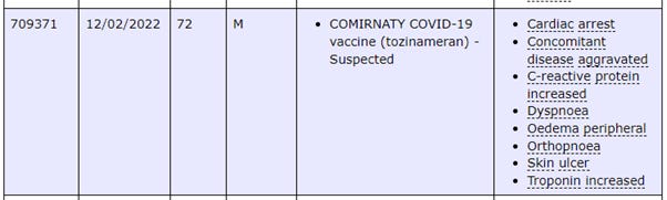
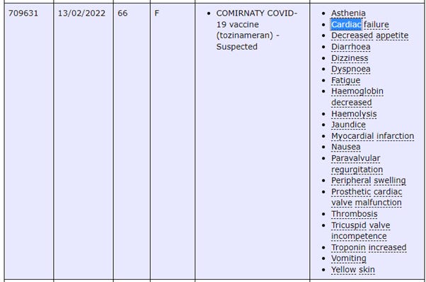
The second report looks like someone with pre-existing cardiac issues from the prosthetic valve noted. This would likely have been a 3rd shot of Pfizer. Could that have been too much for this person leading to a premature death? Only a proper investigation would tell.
The Dr John video notes a range of possible causes of excess deaths, but the timing of the booster roll-out and the peak in deaths shown in this article warrants further investigation.
Summary
What if those in this age group (ie the boomers who have contributed so much to society) knew that there was an increase in unexplained deaths at their age at the time they were occurring. Do they not have the right to know that? Public Health officials obviously do not think so. The citizens might behave in a different way, make different decisions, to what Public Health wants. Is this good or bad? What do you think?
Please stay safe.
As I have been working on this article I came across one from a New Zealand economist at University of Waikato. Titled: “The Rollout of COVID-19 Booster Vaccines is Associated With Rising Excess Mortality in New Zealand”. It is linked in this post from Dr Paul Alexander.
It has very good methodology which I will follow up on to learn from.
Love your work Andrew! April data on the 29th. from ABS too.
Wow. You’ve really outdone yourself with this one. Awesome.
I’ll need to re-read it a few more times to really appreciate it and comprehend it in its entirety.
If it isn’t hard enough seeing the true picture because of the 14 day trick for “cases”, I think it may be even worse than you’ve shown. My interpretation of the fine print in the NSW Surveillance Reports is that the vaccination status for severe outcomes (hospitalization, ICU and death) is taken at the “time of infection”, so the lag could be even greater i.e. 3 doses is counted as 2 doses if someone gets COVID within 14 days of the 3rd dose. For example, if a person got infected within the 14 days then had a severe outcome say 21 days later (close to 5 weeks after the 3rd jab) they’d still be counted as “2 effective doses” in the official stats.
Also, if you haven’t seen it yet, check out how doctors are supposed to “correctly” code COVID deaths per the WHO Guidelines. (I’ll add a link later when I find it). It will blow your mind how ridiculous the coding situation is. If there is even a whiff of COVID in the air “Death by COVID it shall be!”