
COVID From A to Z

I’ve been thinking about how to gain more insight into Excess Mortality. The title of this article will make sense as you read on.
I saw some commentary on the Australia Excess Mortality, saying that all the excess non-COVID deaths are COVID related side effects, including claims that mortality from viral myocarditis is 10 times that from vaccine induced myocarditis. Hard to understand when an Israeli Study, pre-vaccines, found no increase in background myocarditis rate during COVID.
I wonder how are we going to untangle all of this? We just want to know what is going on.
We know all we need is a simple dataset with the vaccination status, date of death and date of last shot for every death. But we will never get that.
In Australia we were boosting, after the country opened up, and the first significant wave of COVID infections (Omicron) hit our country. Infections, boosting and excess deaths all started around the same time. In Australia, pre-vaccines, we were locked down, mostly keeping COVID out, which artificially changed things. So, we haven’t got data pre-vaccines for when COVID was causing significant mortality.
We need countries for comparison where vaccine uptake is low. Are they experiencing the same excess mortality as Western countries? Africa could be used for comparison. African countries have lower COVID mortality than Western countries. It is complicated by the different demographic of African countries. Populations are younger. There are other more harmful diseases prevalent there.
I happened to be looking at my legacy news feed on the phone a few days ago and I saw this article reported on Forbes.
The lower impact of COVID in Africa is something mainstream commentators cannot accept. So, someone is on the job to show that a higher proportion of people in Africa are actually dying of COVID. I followed up the reference cited. The paper is from the BMJ. The researchers, from Boston University, basically went to the morgue of a hospital in the capital of Zambia, Lusaka.
The researchers swabbed a supposedly representative sample (1116) of the dead bodies in the morgue over a period from January 2021 to June 2021 (6270 total in death registry). They did PCR test on each of these and found that 32% had COVID, according to the PCR test. They used a Cycle Threshold of 40 to detect COVID (more on this later).
They did some weighting of numbers, which I haven’t completely understood yet, to account for age distribution and whether death was in facility or community.
The implication is that they don’t test properly in Africa and COVID is rampant causing a third of all deaths in Africa!
These researchers had written a previous paper (published 17 February 2021) on a period in the second half of 2020 where they found 16% of the dead bodies had COVID.
BMJ allows for Rapid Responses to papers. There are none yet on the paper just published but there are several very critical responses by senior Zambian doctors on the earlier paper. In this one the respondents point out that protocols in Zambia do cover thorough COVID testing, contrary to what the authors claimed. They go on to say:
“Key issues of concern that we have raised are that this study was biased and the sample size was not adequate to allow for the interpretation of the data as presented in the article that was published. This creates a lack of respect for science when it is needed to inform policy makers.”
This response is in a similar vein. The criticisms of the first paper include that they claimed results for all of Africa based on a sample from one hospital in one city in one country of Africa. The authors are more careful in their language in the second paper. Rather than the original title “COVID-19 deaths in Africa”, they call it “…prevalence of COVID-19 detection by PCR among deceased individuals in Lusaka, Zambia”
As I said in my last article, the first thing I do when I see a suspicious headline is look at who funded the work. Oh-oh, guess who. The saviour of Africa.
Funding: The ZPRIME study and the covid-19 expansion were made possible through the generous support of the Bill & Melinda Gates Foundation (OPP 1163027). The funders had no role in designing the study; in the collection and analysis of data; or in the decision to submit the article for publication. An earlier version of the manuscript was shared with the team at the Gates Foundation, and some of their comments were incorporated into the final version.
The good friend of the Gates, Tedros, also wants equity for Africa. From this article on 18 June 2021.

With so many deaths in Africa they must need more vaccines, or do they? This article, I found from legacy media, back in 2007, titled: “Unintended victims of Gates Foundation generosity” highlights the problems with ignoring the basic needs in Africa and putting effort into novel technologies only.
Recall also, Boston University, recipients of the funding for the study brought us Omicron Gain of Function research earlier this year. Another article from Forbes, “Gain-Of-Function Experiments At Boston University Create A Deadly New Covid-19 Virus. Who Thought This Was A Good Idea?”
The BMJ paper by the Boston researchers found what they called “provocative findings”. While in Western countries COVID deaths are mostly in the elderly. In the Lusaka morgue study COVID-19 occurred more evenly across the age spectrum. 80% were under 60 years. 10% of the deaths were in children.
Hmmm. That’s not what we expect for COVID deaths.
The paper supplement has a graph showing the percentage of the total deaths in each age group.
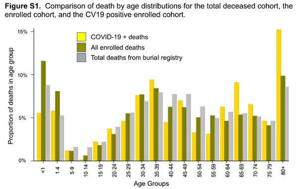
The grey bars represent percentages of all deaths that occurred over the period, ie not just for the bodies swabbed. Look at the shape of the grey bars. You see that there is a proportionally high percentage of deaths in infants under age 5 which is unfortunately typical in some African nations. The 80+ age group jumps presumably because of the larger age range than other groupings.
Yellow is their “assumed” COVID-19 deaths. If you looked at the yellow bars alone the shape basically follows that of all deaths. So COVID deaths follow the same distribution as all deaths? This is suspicious. It is consistent with the PCR test being rubbish and basically finding a fixed percentage of all deaths.
The main discrepancies between yellow bars shape and grey bars shape are at older ages where there are proportionally more COVID deaths found by PCR and younger ages where less are found. We know COVID has minimal effect on the young and most effect on the elderly. So this would be consistent with the PCR tests being mostly false positives and more likely to be true positives in the elderly and true negatives in the young.
There is a table of the causes of deaths of the under 19’s. There were 30 deaths under 19 which they found were COVID. Cause of death on death certificates was mainly Sepsis. Causes also included malnutrition. It seems unlikely any of these were COVID.
The PCR Test
The Cycle Threshold of 40 is a WHO directive. The following figure from the paper shows the distribution of Cycle Thresholds for those considered positive for COVID.

It is showing all the values of Cycle Threshold, for two different tests (N1 and N2 targets) where they said person had COVID. Clearly the majority of values are near 40. If they have to go to a higher Threshold the result is basically considered not COVID.
I start to get a feeling that this study might just be showing that the PCR test is useless. Paul Alexander calls PCR Cycle Thresholds over 20 rubbish. He writes:
“This means that all of the asymptomatic testing was never ever needed. None of it was ever needed and we used the flawed PCR test with the near 95% false positives (cycle count threshold over 24 detects viral junk, dust, fragments, not COVID virus; CDC set the cycle count threshold at 40), to shut down society. You do not mass test asymptomatic persons, you only test ‘symptomatic’ persons with strong clinical suspicion.”
Searching articles on PCR Cycle Thresholds I came across this document posted on the Austin, Texas, government site. It details criticisms of PCR testing. It links to this page titled “Portuguese Court Rules PCR Tests As Unreliable & Unlawful To Quarantine People”, citing this article where the court concluded that:
“if someone is tested by PCR as positive when a threshold of 35 cycles or higher is used (as is the rule in most laboratories in Europe and the US), the probability that said person is infected is less than 3%, and the probability that said result is a false positive is 97%.”
The validity of the PCR test and the Cycle Threshold used adds a new dimension to the analysis. It seems clear that the Boston University study of one African hospital’s morgue is wildly overestimating the number of deaths due to COVID and that the PCR test is hopelessly flawed.
Australia
Now for my reference to Australia. The contributing author of the Forbes article writes:
“Under-reporting of Covid data seems to be the new pandemic spreading across the world”
going on to blame China. He also pokes at Australia because we are only reporting weekly now:
“In the US, the CDC has been updating cases and deaths on a weekly basis instead of a daily basis since late October. This time lag makes it far more difficult to predict risk and surges. State health departments also face an uncertain future regarding the funding they need to continue reporting. Other countries like Australia have also shifted to weekly reporting despite experiencing a higher mortality than any other stage in the pandemic.
Reducing reporting capacity or underreporting globally at a time when Covid variants are evolving to become immune evasive is akin to walking into a storm without checking the forecast.”
Australia for comparison
I’m not sure why Australia needed to be mentioned in a report on a dodgy study at a morgue in Lusaka, Zambia.
We are walking into a storm…
But let’s look at Australia and Zambia together. Latest COVID-19 Death rate (per million) from Our World in Data. Australia in red and Zambia in blue.
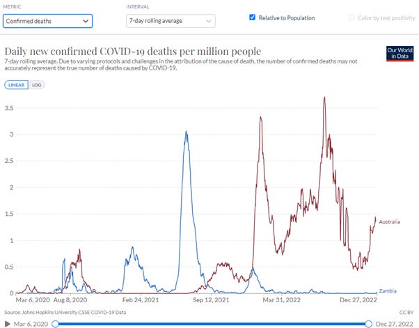
Zambia had a significant wave, I assume Delta, in mid-2021. Zambia then had a very small Omicron wave early 2022 and then nothing. This would seem consistent with natural immunity being built up in mid-2021 and then Omicron having minimal effect on the community.
Australia, on the other hand, had minimal natural immunity due to low COVID prevalence and lock downs. Australia was boosting at the time Omicron arrived end of 2021 and infections went through the roof and have never returned to zero.
I also note that our NSW Chief Health Officer said early December their modelling predicted the current wave would be over by Christmas:
NSW Chief Health Officer Dr Kerry Chant said health authorities expect to reach the peak of the current wave in the “coming week or so”. “And then we will see a decline in cases,” Chant said.
Another expert from UNSW explained in this article the current wave is likely to be a “shorter and smaller version” of the BA.5 Omicron variant wave we saw over winter. He also describes it as “rich soup of Omicron descendants”.
I’m afraid to say deaths are still going up. We are walking into a storm without checking the forecast for soup, according to experts.
If it is true that immune systems are compromised by multiple boosting (more evidence of which is continuing to emerge) what is happening in Australia is consistent with more and more infections leading to deaths in the aged and vulnerable. On the other hand, in Zambia, wide natural immunity appears to have been obtained in 2021 such that Omicron has had a minimal impact.
Zambia has a much lower vaccination rate. Graph below is for the primary series.
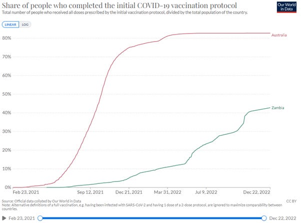
Zambia was only at 10% at the start of Omicron. It ramped up to 40% much later. Let’s hope that immune systems are not compromised in Zambia. There is no information on boosters in Zambia.
If it is true that multiple boosting is the problem then Zambia may be spared the continual waves of infection, leading to deaths in the vulnerable.
Excess Mortality
The Our World in Data site has numbers for Excess Mortality. I don’t know exactly how it is calculated but it will give us some idea what is going on. Below are the graphs for total deaths per million for Australia and Zambia and also Excess Mortality.
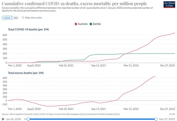
There is no mortality data for Zambia available from the Our World in Data site, so excess deaths are shown only for Australia (red) in the bottom of the graph above. Australia Excess Mortality crosses zero at 12 December 2021, which is around the time of Omicron arriving and boosters ramping.
Zambia Data
I realise my articles are sometimes too long for reading on the phone. I have put a section, where I tried to find what data is available on mortality from an African nation, as an appendix. On this last day of the year there are probably more fun things to do.
Final Thoughts
As I am writing this a Dr John Campbell video has just come out, 29 December 2022, with an update on Africa, titled “No apparent COVID in Africa”.
He reports on the WHO still pushing to get 70% of Africans vaccinated.
There is an update from Wefwafwa in Uganda. It so clearly highlights what the real issues are in Africa. They do not need COVID vaccines. Local doctors are not seeing COVID in the community. They need mosquito nets (to protect from Malaria), they need clean drinking water (to protect from Cholera – 50% of severe cases die within a few hours). The picture below shows mattresses provided from donations through Dr John Campbell’s and Wefwafwa’s channels so children don’t have to sleep on the ground.

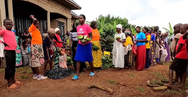
The picture below shows people in the community Wefwafwa supports getting some food for Christmas from donations.
So we have travelled from A to Z and as this year comes to an end I wish the readers all the best for the coming year as we work together to understand what is going on in our world. We see money wasted and where money is needed. We hope understanding data will help make a better world.
Appendix - Zambia Data
I thought it would be interesting to look at Excess Mortality for African countries, if such data is available. Can we find out number of deaths for Zambia?
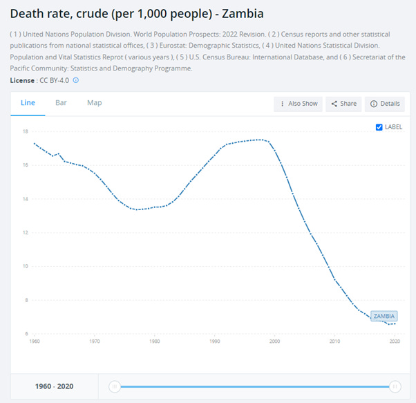
I searched on some country aggregator sites like this one. It seems death data for Zambia is only known up to year 2020.
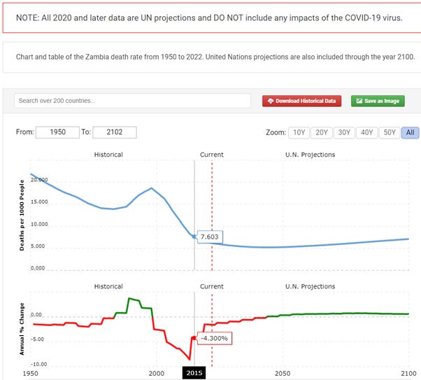
The graph above also has UN predictions, which are probably useless. Zambia’s death rate has been decreasing which is good. In graph above I show 2015 value on the graph, 7.6, for reference against other data found.
Zambia population is found here. Current (2022) population of Zambia is approximately 20M. In 2015 it was approximately 16.3M according to this site.
From this site deaths data is also shown up to 2020.
From a spreadsheet downloaded from this site for 2015 it was 7.2 per 1,000 people (note slight difference with other source) and for 2020 it was 6.6 per 1,000.
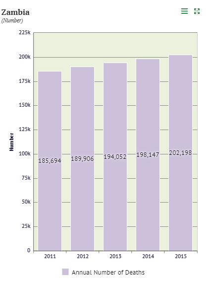
There is a Zambia Statistics Agency and I searched for data there. Deaths were found here. It seems only data up to 2015 is published.
The population of Zambia is found here.
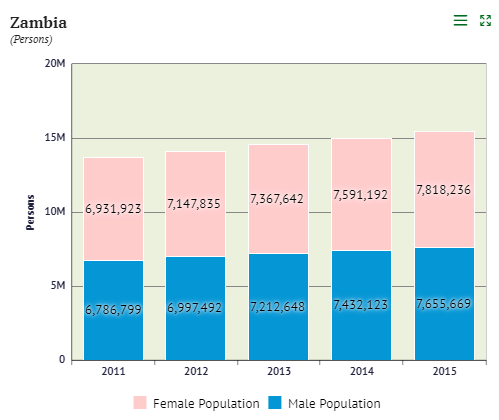
So for 2015 population is 7,818,236 male + 7,655,669 female = 15,473,905. So a bit different to the other value reported, ie 16.3M.
Crude death rate per 1,000 in 2015 is therefore 202,198/15,473,905 x 1,000 = 13.6. This is different to the estimate shown before for 2015 from another source which was 7.6.
The Statistics Agency shows a chart for Crude Death rate which gives the number 13.1 for 2015.
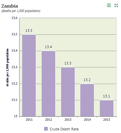
Definition of Crude death rate is population at middle of the year. Perhaps this makes a difference. In any case the value is very different to that reported by other United Nations sources.
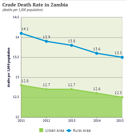
The graph below highlights that death rates are higher in rural areas compared to urban areas, presumably because of access to health facilities.
The reason for including this detail on my search for data on mortality in Zambia is to highlight that it seems it may be challenging to get good data. I am not sure if that also applies to other African countries.
Good read, and well debunked. From what you have said, they are putting all the deaths "with covid" down to "from covid"? i.e. even if the test was accurate, it is still a stretch to say that they all actually died because of covid - if covid is as prevalent as claimed, the fact that people had covid when they died is neither here nor there? But I think you are right - what this is is proof the PCR tests are nonsense (ps do they even work at lower cycles on dead bodies?)
Thank you for all your balanced and interesting substack posts. You may have seen this paper already - originally posted by Dr Clare Craig on Twitter.
In a small study of 57 participants, 47% tested positive by PCR for a respiratory virus post-mortem whereas only 7% had had a clinical diagnosis before death and only 1 subject had a respiratory viral infection (influenza) listed as the sole cause of death. Unfortunately the conclusion suggests more postmortem testing may be required. 😖
We seem to be struggling as to where to draw the line on many aspects of testing - from PCR amplification cut offs to testing of asymptomatic people (otherwise known as the healthy) or even testing the dead. Doctors’ skill in clinical diagnosis seems almost passé. One thing is certain, the more we test, the more we’ll “find”.
https://www.ncbi.nlm.nih.gov/pmc/articles/PMC6038767/
You may also be interested in my favourite video/analysis (20 min) of the Covid debacle - by @ProfessorAkston on Twitter. He describes how testing blew up the 2009 Swine Flu Pandemic out of all proportion to its impact, creating fear and panic, and how the same play book is being applied to Covid. https://www.youtube.com/watch?v=5EppELuO4T0