
Thanks for the Decimal Places
Thanks for the Decimal Places
another look at the South Australian data

Our family has some wonderful news. Our daughter had a beautiful baby boy last week, our first grandchild. It makes one realise how important it is to work towards looking after future generations, and particularly their healthcare.
In this article I am going to do some reverse engineering to try to get some raw numbers from the South Australian report that showed us that:
Unvaccinated are Five times more likely to die!
This was announced on the day that 5th jabs were being rolled out in Australia. Interesting in this week’s legacy media news I see South Australia is preparing for another wave of COVID, based on modelling™.

South Australia’s Chief Public Health Officer is shown boldy looking into the future. She appears less concerned than she was in June last year, about the dangers of the football spreading COVID if kicked into the crowd.
“I have noticed occasionally the ball gets kicked into the crowd, we are working through the details of what that will mean,” she said.
“If you are at Adelaide Oval and the ball comes towards you, my advice to you is to duck and do not touch that ball.”
This was at the time there were severe restrictions in Australia. People could not cross borders, could not see elderly loved ones, yet a football stadium could be packed and you were safe if you dodged the football.
Going back to the new COVID cases, maybe it is a 5th wave? Or is it a 6th?
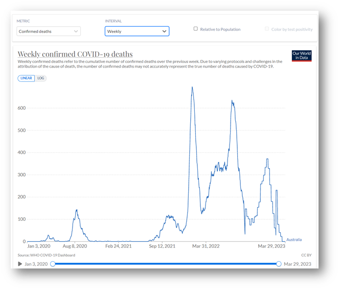
Let’s take a another look at the South Australian report. Rebekah Barnett did an excellent summary of the report at the time.

Stay tuned, Rebekah has more to update based on a Freedom of Information request through Senator Antic’s office.
I went back to my original article.
I saw that I estimated that there were 350 deaths over the period, Aug-Oct 2022, in South Australia, based on data found here by subtracting cumulative values shown. When a more detailed report from the South Australian Health and Medical Research Institute (SAHMRI) was released, found here, upon requests from the public, we find a table that shows the number of COVID deaths, which the analysis is based on, to be 174. Have they done a sample? Is it people from COVID/with COVID? Not sure why this is?
I recall seeing in the comments on one of the articles on this SA report someone making a comment about the number of decimal places provided (was it Geoff?). This got me thinking. If there is enough resolution in the decimal places we might be able to work out how many people there are in each group and check this data.
This is the thing, the authorities only ever give us some of the variables. The health authorities believe the public only need to know certain details and then Trust the Science™. We are provided deaths by doses and deaths by age, but never the ages and doses of those that die. But with the decimal places can we infer more information? We know that the number of deaths and number in population have to be whole numbers.
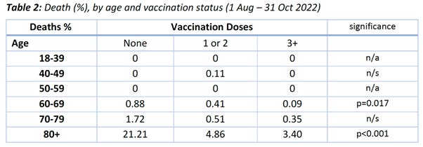
I originally didn’t understand what the percentages shown in Table 2 from the report meant. See below:
I sent an email to the info address at SAHMRI address and I actually got a reply within a few days from the author of the report!
Unfortunately, I then asked for some further information and offered to do the analysis in an alternative way, but the radios went silent.
The percentages apply to the number of people in the category. For example, out of the total 70,000 people who had reported infection, for those age 80+ and who had zero doses, 21.21% of that group died.
Now we know that the number of people in Australia, over 80 years, who have not been vaccinated, is very small. There will basically be two subgroups. Those who are physically healthy conspiracy theorists. They will likely not even report that they were infected (there is no legal obligation to do so) and so don’t even come into this analysis group. Then there will be those who are frail and have not been vaccinated for fear of adverse reaction or have other medical conditions where vaccination was not recommended.
Now from the following table in the report:
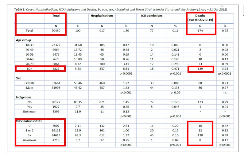
We find that only 16 people total, with zero doses, died, out of the total 174 deaths. I put red boxes around the relevant numbers I use.
If we scan through all the possible numbers of deaths, of those with zero doses (total 16 or less) and population less than 3,825 (for age 80+) there are only certain number combinations where that ratio is exactly (or very close to) 21.21%.
I started exploring this in Excel but then eventually wrote a program. I’ll spare the details but only some number combinations are possible, for the tabulated percentages with 2 decimal places, given that numbers of people have to be whole numbers.
For 80 years plus, the possible combinations of deaths with no doses turn out to be:
7 deaths in a population of 33 or
14 deaths in a population of 66.
The ratio is 0.2121. It could be the 7, with other zero dose deaths (9) spread between the 60’s and 70’s age group. This is what I came up with as the possibilities for doses of those that died age 80+.
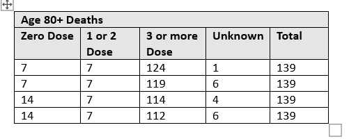
The corresponding populations in each sub-group are:
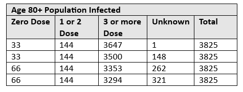
The unknowns complicated things. The authorities seem to always know the age but not always know vaccination status. How they could not know the vaccination status of people who die with COVID is suspicious. I imagine if they are unvaccinated then it will definitely be recorded as zero dose.
Other information used in my deductions includes, for age under 60, only 2 people died. The tables also tell us that the only deaths under 60 had 1 or 2 doses. So we know that there must be less than 10 deaths, with 1 or 2 doses, ages 60 up. Each little bit of information helps. Looking at the hospitalisations table in the report, shows that 50.00% of the 80+, No Dose people that were infected were hospitalised. The table above indicates either 33 or 66 for the number of people infected in this group. 50.00% were hospitalised. Therefore it must be the 66 option. We have to have a whole number of people.
I know. I’m spending too much time on this. But the potential of a dataset where we know all the variables has been too much for me to resist.
So we find that of all the COVID deaths of people who were unvaccinated, the majority (14/16) occurred in people age 80 and above.
No matter how you look at it SA Health is basing the advice for being 5 times more likely to die from COVID on deaths of people in their 80’s. Their analysis method basically tries to claim a rate across the whole population. The limitations of the assumptions they have to make is too detailed to go into here.
From the following table in the report, based on the Bayesian Logistic Regression, they come up with the figures they quote to the public. The line for No Vaccination, with a median of 5.22 shown, is what they base their 5 times more likely to die on.

The baseline individual (for comparisons) was defined as Female, Non-Indigenous, Vaccinated with 3 or 4 doses, and Aged 18-39.
We know that only 2 people under age 60 died. They were people with 1 or 2 Doses in the 40-49 age band (from Table 2 of the report shown earlier). No one died under age 40 or in their 50’s. Yet there is still an estimate for people in their 50’s. I believe this results from the Bayesian method using a prior assumption. From the table above the value of the median value of the Odds Ratio for age 50’s is 0.05. Less than 1 means less likely to die. So people in their 50’s are 20 times less likely to die!
Note in my original post I had things wrong way round, pointed out to me by a colleague.
In your 40’s you have the same chance of dying as being unvaccinated. The confidence interval is large so we know these results can’t be trusted.
For Indigenous people the median number is less than 1. So they are less likely to die. Sadly one indigenous person passed away out of 1,927 indigenous (ratio 0.0005). For non-indigenous the ratio was 173/60,127 = 0.0029.
However overall, the advice to be vaccinated, for all ages from babies 6 months old and up, is based on deaths of people in their 80’s.
Let’s now take a look at the overall mortality of our population in Australia in their 80’s. Last Friday was the end of March and the Australian Bureau of Statistics (ABS) released the provisional mortality data for the whole of 2022. The latest release is always found here.
Downloading at the data for ages 85+ and plotting we get the comparison of 2022 deaths with the baseline.
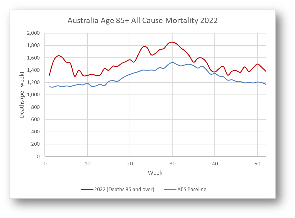
There were a total of 78,868 deaths in 2022 for this age group. This is provisional and will increase once data is finalised. The baseline total is 66,806. This is therefore an increase of over 12,000 deaths from what may be considered normal.
Now there can be arguments that the baseline is too low, blah blah. In the background I am going through various ways to make estimates of the baseline. We also know there is excess mortality due to COVID. Data is not provided on COVID deaths by age but we can make an estimate of the number of deaths in this age group. The ABS data on COVID mortality here shows 9,986 COVID deaths (both doctor and Coroner certified) in 2022, all ages, in Australia.
There is a table of ages of death for the whole of the COVID period from 2020 to Jan 31, 2023. For age over 80 there have been 8707 deaths over age 80, and a total of 12,639 deaths overall. This means 68.8% of COVID deaths have been age 80+. I will use this percentage to estimate number of deaths over specific periods where we don’t have any age breakdown.
The total number of COVID deaths in age 80+ for 2022 can be taken as approximately 69% of 9986 = 6,890. The number will be less for ages 85+.
This means there are something like 6,000 deaths in 2022 of people over 85 that are unexplained.
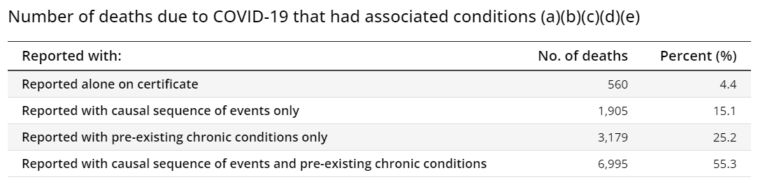
In practice many of the COVID deaths in this age group may have occurred in any case. The ABS COVID report shows that the majority of COVID deaths have pre-existing chronic conditions.
I suspect the number of non-COVID excess deaths is higher than the simple calculation.
The 7 or 14 people unvaccinated in South Australia are already accounted for in the COVID deaths. So what is the cause of the rest of these non-COVID deaths? What have we done to our elderly population?
What we do know is that Health authorities have failed the public. The young have been exposed to unnecessary risk, with no quantifiable benefit through vaccination. The elderly are experiencing unseen levels of excess mortality, not from COVID. The majority of the rest of the population in Australia have gone along with it like sheep.
All I can say is remember the advice from SA Health:
Duck if the football comes toward you.
On a positive note, for those in the Sydney area don’t forget our community event on 29 April. That’s 4 weeks away and we need final numbers in 3 weeks.
The event is in support of Father Dave Smith’s work with disadvantaged youth. Professor Gigi Foster speaking and an update from our Firefighters. We sampled the menu during the week. Yum. 3 course meal and drinks included. Dancing and some surprises on the evening. It’s shaping up to be an amazing event. I hope to meet some of you, who I have met virtually, in person.
This is the booking site:
https://www.trybooking.com/eventlist/eventListingURL?aid=177504and read the article I wrote on the background for the event.
'Baysian logistic regression' - ah, that takes me back (kicking and screaming) to uni days.
A nice bit of statistical reverse engineering, which exposes the SA Health Department as real frauds.
In the competition for worst state Chief Health Officer during the Covid baloney, Spurrier must rank pretty high, doing her best impression of the madwoman in the attic.
Great sleuthing. I've been trying to obtain similar data for Tasmania but the health authorities here never release it.