Data Chaos - Part 1
Australian Institute of Health and Welfare Report on Hospitalisation and Death following COVID-19

I came up with the title after watching this interview with RFK Jr:
Apparently, there is resistance to his initiatives to set up databases on autism to try to understand what is going on. At 9 minutes he explains:
“one of the problems … has been a data chaos”
It seems a very apt term. The term chaos in a strict technical sense doesn’t mean completely random but rather that there is a hidden structure. The comment sunk in as I have been pouring over a report, which while based on important data, shows more than anything how little we know.
The Australian Institute of Health and Welfare (AIHW) released a web report at the end of April 2025, found here. It’s quite involved and is based on a linked dataset called the COVID-19 Register, which takes all registered covid cases and links them with other separate government databases, like the Australian Immunisation Register (AIR), to try to gain health insights. The top line of the report:
This report examines hospitalisations and deaths for people with COVID-19 during the first 3 years of the pandemic in Australia, with a focus on the height of the pandemic when the Omicron subvariant of the SARS-CoV-2 virus dominated. The role of COVID-19 vaccination and antiviral use among people with COVID-19 was also examined.
Unfortunately, the report tells us very little about the role of covid vaccination, due to hopelessly confounded comparisons. I haven’t had a chance to look at the anti-virals section. We know the evidence for benefits of Paxlovid is weak, as discussed by Vinay Prasad here:
“Paxlovid only has positive data in unvaccinated high risk people who have not had COVID”.
When I started writing this Data Wise substack I wanted to understand and explain the data that was publicly available regarding covid, with the health of Australians in mind. In particular, I felt it was important to investigate where data was at odds with public messaging.
The AIHW report highlights the following points:

The bottom right one, regarding vaccination, is a statement being inferred from the data. My review of the report tells me that the assertion cannot be made.
This article may get a bit too long for some readers, so I’ll summarise up front, and those who I know want to dive in deeper can follow along later sections, there will also be a Part 2 to cover what we actually know of the proportions of people vaccinated in Australia. Some of this stuff messes with your head when you try to work out what is really going on with the data. Also, I’d be grateful for any comments or insights readers can provide along the way.
The AIHW report claims;
hospitalisation rates were 4 times higher in unvaccinated older people than those with 3 or more doses.
There are two things wrong with making this assertion based on the data. First there is a problem with the sample from the Australian population that the dataset is based on. The sample is of people with a covid diagnosis from a test. This is not representative of the whole population. This includes issues like the accuracy of the covid tests, which depends on the type of test, but that’s outside the scope of this review.
Second, from what I am observing, I don’t think we have any idea about how many people are unvaccinated. Especially in the older ages where the vaccination uptake is close to 100%. In fact, official numbers show more jabs than population in older age groups. So, we don’t really know what the unvaccinated proportion of the population is, as well as the flaw of making inferences by comparisons between a tiny group of people and a large group of people. And there is absolutely no reason to think that the demographics and health background of the people in those disparate groups are similar in any way.
I am going to go through in detail the numbers for the 80-89 year age group, which is where a lot of the covid deaths occurred.
Who are the people who are unvaccinated in this 80 year old age group?
There will be some “antivaxxers”. These could include retired professors of medicine who had the time to look at the reports coming out and made a calculated decision based on the data they reviewed.

Unvaccinated, or less vaccinated, could be frail elderly people, close to death, where a medical decision is made not to risk the intervention because the risks outweigh any benefit.

However, we do know of instances where people close to death were still given the vaccines. We basically have no idea what the makeup of the very small, unvaccinated group is.
Also, people who were given the vaccine and died from covid shortly after are not considered vaccinated or they are allocated to the previous dose group. This was a big effect overseas for the first 2 doses but not so much here in Australia, as when jabs were initially rolled out there was little covid in Australia. However, the third dose was rolled out in Australia right during our first big covid Omicron wave (starting end of the year 2021). So, people who died from covid in the first big wave would be classified 2 dose, even though they had 3. I have plotted out 3rd doses and covid deaths from November 2021 to March 2022, bracketing the first major wave of covid in Australia.

Clearly, a category of people who had recently received a dose needs to be considered as an individual category. There will be people who recently had a 3rd dose and died from covid in this period (as well as from all causes for that matter).
All through my data science work the main thing I have found that stuffs up analysis is miscategorisation of data items.
Dodgy analysis under the microscope
Two things that have occurred in the last week highlight that the time for dodgy analysis might be drawing to a close. A paper has just come out by MIT Professor Retsef Levi and senior author, Florida Surgeon General, Joe Ladapo, titled “Twelve-Month All-Cause Mortality after Initial COVID-19 Vaccination with Pfizer-BioNTech or mRNA-1273 among Adults Living in Florida. Taking data from the Florida medical system, they have made a comparison of all-cause mortality between the Pfizer vaccine and the Moderna vaccine.
The reasons they have done the study as a comparison between vaccine brands is because it is clear that there is no way to make comparisons between vaccinated and unvaccinated categories, for exactly the same reasons I described above. In the US medical system, the problem with the unvaccinated category has been well documented. People with unknown status and actually vaccinated have been shown to be included as zero dose in CDC analysis. Jefferey Jackson did a brilliant piece on this on the Highwire some time back. When the CDC was saying that everyone in hospital was unvaccinated it turned out that half of them were actually vaccinated following a review by researchers done later. The issue was to do with there not being a separate category for unknown dose in the electronic record system.

The paper is found here.
Results: A manual query of the local Immunization Information Systems for 4114 adult patients with "unknown" vaccination status showed 44% of the patients were previously vaccinated. Attempts to assess the comprehensiveness of the Immunization Information Systems were hampered by incomplete documentation in the chart and poor response to patient outreach.
Conclusions: When the interface between the patient chart and the local Immunization Information System depends on a manual query for the transfer of data, the COVID-19 vaccination status for a panel of patients is often inaccurate.
Back to the Levi, Ladapo paper, Nicolas Hulscher’s substack provides a summary here.
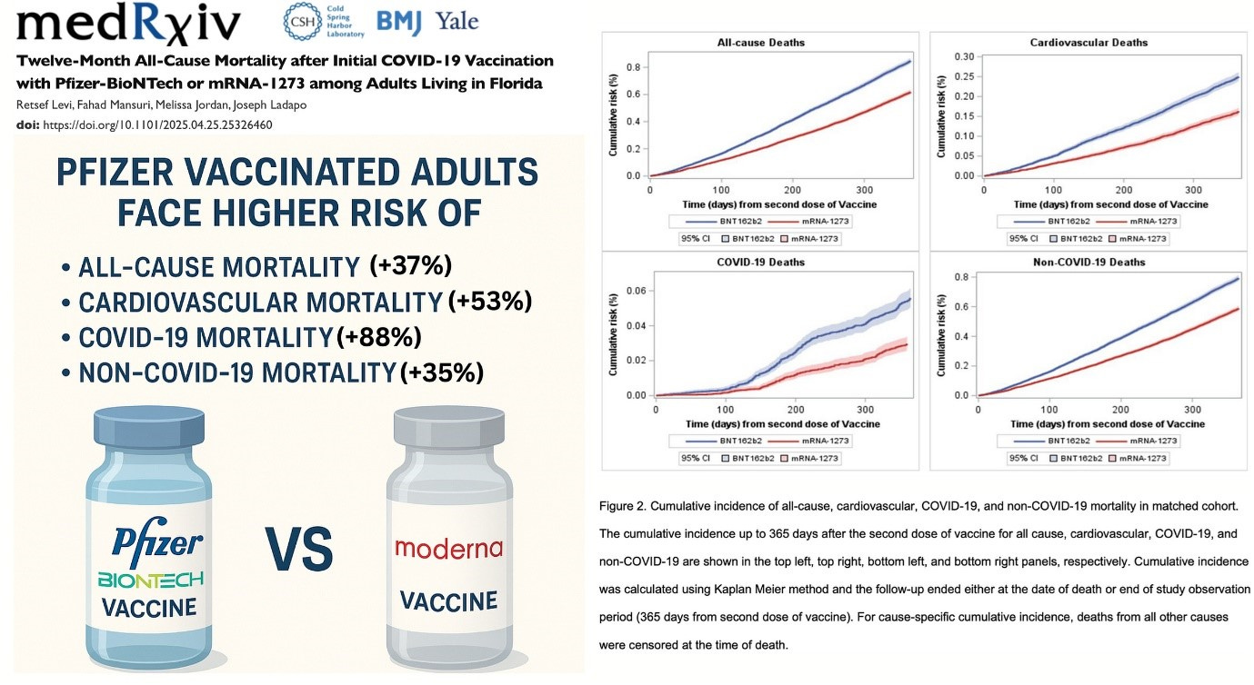
In the Florida paper they go to extreme care to make sure any comparisons are valid. They even match people depending on where they got their jabs from, eg chemist, doctor, etc. This matching is critical to make fair comparisons. They are looking at people with the same number of doses, with the same characteristics but just comparing the type of jab, which in theory shouldn’t make a difference (except perhaps for covid deaths, if one of the vaccines was more effective than another).
All-cause mortality increased by 37% in the Pfizer group compared to Moderna. There shouldn’t be any significant difference.
Now this could mean that the Moderna vaccine improves all-cause mortality and so the Pfizer result is OK. But all-cause mortality is up overall so that seems unlikely. Some commentators are making estimates of number of lives lost based on this data.
The other interesting news is that Vinay Prasad, who I referenced above, has been named Director of the US FDA’s Center for Biologics Evaluation and Research, ie in charge of vaccine and biologics approvals, in the RFK Jr health administration. Written about here by Alex Berenson and here by Carl Heneghan and Tom Jefferson. Prasad has been very strong on the need for controlled trials and critical of useless data analysis. In particular, he made it clear there was no evidence of benefit of boosters from trial results, due to the people getting the boosters being very different to the group who didn’t. This bore out in the data analysis where boosted people had improved outcomes appearing from the day of injection, which just tells us they are a different category of people. He is also critical of covid vaccines for children, based on no evidence. He made it clear in his writings and videos that comparisons being made by CDC were nonsense in a very convincing way.
The time for bullshit comparisons is fast disappearing.
Let’s get into the data
First of all, this data is limited because it only covers a sample of the whole population, ie those that had a registered positive covid test. Apparently, that is only one third of the population of Australia, about 8 million people. The report looks at data up to the end of 2022 and we suspect that many more people than one third of the population had caught covid.
Another point is that the data does not include the state of Western Australia because that state had submitted their data to a different database that is intended to be used in the future.
I know the limitations of the covid testing data from my own experience. I caught covid at the end of 2021, at the time when vaccinated travellers brought Omicron to Australia and it took off. I thought I would “do the right thing” and get tested. At that time, when people really had covid, the whole testing system collapsed. I suspect this had something to do with the way they batch tested samples to find any covid. Batch testing was effective when covid was rare. When just about everyone has it you have to individually test every sample.
When there was little covid in Australia, from 2020 till the end of 2021, people were queuing up in droves to get tested. You had to scan to get into a coffee shop. People would get a text message warning a day later, stating that someone who had been to that same coffee shop had had a positive covid test. Sometimes it was later in the day from the person’s visit to the coffee shop. This prompted some people to go and get tested. That’s right even if the alert was from later that day.
I recall I drove myself to one of the centres and it had already closed by 7:30am because apparently testing had already “reached capacity” for the day. RAT tests became available around that time and people went crazy trying to get them. At one point the only place you could get them was at enterprising tobacco shops. In fact, I suspect many people who caught covid and had no serious adverse effects do not have a recorded positive test.
And then again there are people who needed a positive test for various reasons, eg to get time off work, whether legitimately or other, or for an unvaccinated person to get a short-term exemption, which was allowed for a period during 2022.
Of course, these are just anecdotes, and care is needed in generalising.
Data is more than a bunch of numbers
The thing I want to get across is that the data is more than just a bunch of numbers for comparison. If you are working with this sort of data you have to have some understanding about how it was collected, what was going on and when.
If you dig deep into the AIHW report and the technical notes the report states:
There may be potential confounding effects that also contribute to health outcomes including other illnesses and comorbidities, or how the eligibility for vaccination was prioritised for those with higher risk of severe disease. This report is descriptive in nature and does not warrant evidence to infer causation.
They admit that no conclusion of causation can be drawn from this data. In another part it says that you can’t make any inference about vaccine effectiveness.
When interpreting results in this report, it is important to consider:
staged rollout of COVID-19 vaccination, where selected groups, usually those at highest risk of severe disease, were recommended and prioritised for vaccination.
findings have not been adjusted to account for age, pre-existing health conditions and/or other characteristics (such as geographical location or living in a residential aged care facility) which may predispose these groups to vaccination or increased hospitalisation.
people who died during the study period were included in the analysis. People who died, particularly in the oldest age groups, may be more vulnerable and susceptible to hospitalisation than others.
data in this report cannot be used to infer vaccine effectiveness.
However, that didn’t stop the headline for the report:
unvaccinated more likely to be hospitalised…
The third bullet point above is a caveat is trying to say that people who were most at risk were the ones getting vaccination first.
The COVID Deaths
Let’s count the covid deaths in this data

Most of the deaths, over two thirds in number, are people in their 80’s and 90’s. Counting the official number of covid deaths up till the end of 2022 from this ABS report the number of covid deaths from, and not with, both doctor and coroner certified, is 12,562. WA up to end 2022 is 650, which we have to subtract as WA is not included in the AIHW analysis. So somehow 3,000 covid deaths are not in this sample. The AIHW technical notes state:
It is important to note that the number of COVID-19 deaths reported in the COVID-19 Register may differ from those reported by the Australian Bureau of Statistics and state and territory health departments due to the nature of probabilistic linkage and differing definitions used.
So perhaps 3,000 out of about 12,000 could not be linked. It seems like a lot. Any inferences would assume that the distribution of these unlinked cases are the same as the rest.
Case fatality rate for different vaccination status, is shown in a graph from the report below:

Confidence intervals, ie the vertical black lines, when large means the rate is based on small numbers for those categories. This is the case for 0 and 1 dose. Remember, also this is the rate calculated from the sample of only a third of the population with a registered covid diagnosis. For 80-year-olds the proportion of the total Australian population of 80-year-olds was only 23% according to numbers in Figure 1 of the AIHW report.
In theory the sample should pick up every covid death, because every covid death is known. When the linking is done between different databases names don’t match and so records drop out. There is no information about the “quality” of the dataset but if my calcs are right there are about 3,000 covid deaths not included, which we assume couldn’t be matched, which I find hard to understand.
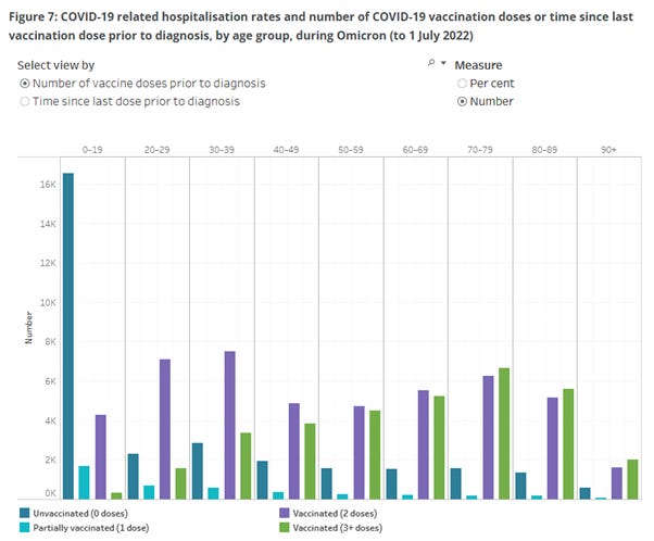
Covid death numbers, against vaccine doses, shown graphically are as in Figure 9 of the report, see below:

The largest number of deaths is in 3 dose people, for all age bands shown above 60. 2 and 3 dose numbers are approximately same for age band under 60. But of course, in the older ages most got a third dose early in 2022 and they make a higher proportion of the population, so the rate is less as per previous graph.
Let’s count the deaths for each dose up:

Now in this analysis I assert that we have no idea how many are really in the zero-dose category. The 0-dose category is effectively a combined zero dose and “unknown status”. More on this in Part 2.
The one dose category is a special one because this is either:
people who died shortly after the dose and had no chance to get a second (although in Australia covid deaths may be small here) or
they had such a bad reaction to the first that they didn’t risk a second. With the harsh measures in Australia, people did not get one dose only because they were too lazy to rock up and get a free vaccination.
Many people died with 2,3 or more doses. Clearly covid vaccination did not stop death from covid, irrespective of death rates based on population of dose categories. The AIHW analysis also looks at socioeconomic status and geographical area. Richer people had better outcomes than poorer people. We know this is true for many other health measures. Richer people also may have had better access to doses and that’s the only difference.
Health Messaging
The government health messaging was that the only thing that would save you, and everyone else, was getting vaccinated. Now, even if extra doses did protect as manufacturers claimed, the one-dimensional messaging swamped any other health messaging, like saying:
make sure Vitamin D levels are sufficient, getting sunlight;
maybe even some low-cost antivirals, given early and in the right dosage might have helped;
nasal and oral mouthwashes.
No such health messaging was provided except by a few honest health advocates.
Can we do any fair comparison with this data?
What sort of fair comparison can we do with this data, knowing the limitations? It is confounded data. We could assume the number of people being hospitalised and dying, attributed to covid is accurate. However, there are questions of some deaths and hospitalisations really being covid rather than a positive test result. Nevertheless, we can make a comparison between those groups and check for different doses. We calculate the ratio of those dying from covid once hospitalised.
Ratio of Death/Hospitalisation in percentage:

We don’t believe anything in the 0 dose for reasons already noted.
For 1 dose people in their 80’s the situation is bad. 50-50 chance of dying once sent to hospital and almost certain if in the 90’s. Comparing 2 and 3 doses it seems clear that more doses didn’t help survive if hospitalised. 3 dose percentage is higher than 2 dose for all ages shown. In fact, for 90-year-olds, the rate of death in hospital is twice as high for people with 3 dose compared to 2 dose. 80% of 90-year-olds with 3 doses hospitalised subsequently died.
Are the people in these two categories (ie 2 and 3 dose) that different? The message could have been don’t go to hospital because you are almost certain to die if its covid.
This is the sort of assertion that the notes from AIHW above are referring to, repeated below.
people who died during the study period were included in the analysis. People who died, particularly in the oldest age groups, may be more vulnerable and susceptible to hospitalisation than others.
They don’t want the inferences above being made which are the opposite way to the narrative. I don’t disagree. The question is can anything of use be drawn from this data? The data are showing us that the people making up each dose category differ in specific ways. The analysis is not “controlling for these differences”.
In the AIHW technical note the implication is that 3 dose people are sicker because they were prioritised. From other data we know that 3 dose people overall are healthier. Of course, this is the reason we can’t make any valid comparisons with the zero dose/unknown dose. Zero dose people include some who were not vaccinated for fear of adverse reactions and other serious conditions that covid jabs had not been approved for.
I maintain that unvaccinated 80- and 90-year-olds, which where the majority of covid deaths occurred, are a very different group to those with 3 or more doses and therefore no valid comparisons can be made.
A colleague had pointed out this ratio of death to hospitalisation effect to me with the NSW Health data early in the pandemic. The data showed that the risk of death following hospitalisation was higher the more doses. In NSW when they distinguished true 0 dose there were times with no people hospitalised in NSW.
We can’t trust anything about the 0 dose category in this data. It is a mix of 0 dose and unknown dose (my Part 2 is going to look into this further). That being said, 1 dose is worse than zero dose in the table above. Those with one dose were the most likely to die from covid if hospitalised. The one dose people are a clear category that warrant further investigation as to the adverse effects they suffered. I think that is one clear result that can be drawn from this data.
I didn’t do the comparison for the younger age because it didn’t make sense. They have combined a group age 0 to 59. There are a large number of hospitalisations of children (see Figure 7 below). Those under 5 would have been not eligible for doses for a large period of the study. With young children any sort of sickness prompts parents to take them to hospital for safety.
This article is long enough already. My analysis of what we know of the proportion of unvaccinated people will be for a Part 2 substack.
Summary
It is not valid to make any statistical inferences from this data
Comparisons made between different dose groups are not valid. Even comparisons between 2 and 3+ doses are unlikely to be relevant
People with one dose only appear to have had a particularly bad outcome and this group deserves special attention
The majority of people who died from covid had 2, 3 or more doses. Health messaging focusing only on more doses was to the detriment of other possible protective measures
I initially resisted updating my AI generated image of our senior doctor getting away from police. It looks like a British policeman. I couldn’t help myself to update it to Australian police, and add a few extras in the chase.

The section on those who could not be vaccinated due to age and health is quite important regarding the public messaging. Everyone was pressured to get vaccinated to protect that group of people yet when stats of unvaccinated hospitalisations and deaths were announced in the media, it was always mired in the tones of "anti-vaxxers" being the the only people in that statistic.
In relation to the one dose category, my brother-in-law and sister-in-law had one dose each as 'requested' by their employer. Because they weren't followed up they managed to avoid having a second dose and chose not to.