As mentioned in my previous article I was asked to provide an update on excess mortality in Australia. This article serves as a summary.
Also, John Campbell posted a video a few weeks ago, where he starts with a quick look at where excess mortality is up to in various countries. Australia is referenced at 1 min 25 sec.
I’ve set the youtube link above to jump to the spot.
A few people have asked me is this correct? ie that everything has gone back to normal? In the episode he goes on to discuss the British Heart Foundation releasing a press release: Alarming increase in cardiovascular deaths and heart deaths, which was the reason for his reviewing where excess is at.
Another question I have heard is what’s the rate of deaths now? That’s not exactly the correct question and I’ll try to explain below.
Our World in Data Estimates
So, I’ll go through what Our World In Data shows, which is what Dr John is using for his data, and then refer to a few other estimates of excess mortality. At the Senate Hearing last week:
A question from Senator Rennick is referred to me. It is at the 3h40m50s mark in the youtube. He asks what caused the increase in mortality in 2021?
You will see Julian Gillespie pass me a note during the exchange. What do you think Julian was telling me to say? A prize will be given for the correct answer (a free subscription to this substack) 😊
At 3h42m10s, I state that the important measure now is “Cumulative Excess Mortality”. The question finishes at 3h43m50s where he goes on to ask questions of the doctors on the mechanisms of the vaccines.
Our World In Data Mortality
OK how does Our World In Data compute its excess? Everyone uses these sites, but you really need to check first where the data comes from and if there is some calculation involved what do they do? For anyone interested in following this through I’ll provide the steps or jump to the next section for other estimates of excess mortality. Start here. Then see this section about how excess mortality is computed which references this paper. The method they use is called “fixed effects” regression. The detail is found in the Materials and Methods | Excess Mortality section of the paper.
Fixed effects regression computes individual intercepts for all variables and keeps a common slope. For their regression the data for each week is a variable. It’s just another method to generate a model to predict data.
They get the data from the Human Mortality Dataset and World Mortality Dataset. For the World Mortality Dataset, which they use for Australia, we find:
So, the data comes from the ABS. OK.
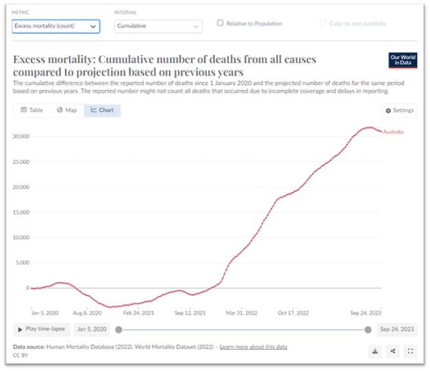
Here’s the current excess for Australia computed using this method, similar to what Dr John showed.
Indeed, the excess is below zero at the latest available time. Implying all must be good as Dr John hopes. The cumulative excess is as follows:
So, the Cumulative Excess is about 31,000 and appears to have just turned downwards. This model produces a cumulative excess that is lower than other methods. It may not be intentionally so. It just highlights that there is uncertainty in this quantity.
We also know that this is looking at highly aggregated data, ie taking the whole population with widely differing subgroups. Assuming the dynamics are the same for young and old people, is an oversimplification leading to increased uncertainty.
We have to remember that the ABS provisional data, which is for the current year, is always lagged. It takes at least 3 months for the numbers to stabilise. This is due to the way data is reported to the ABS and coroners’ reports coming in late.
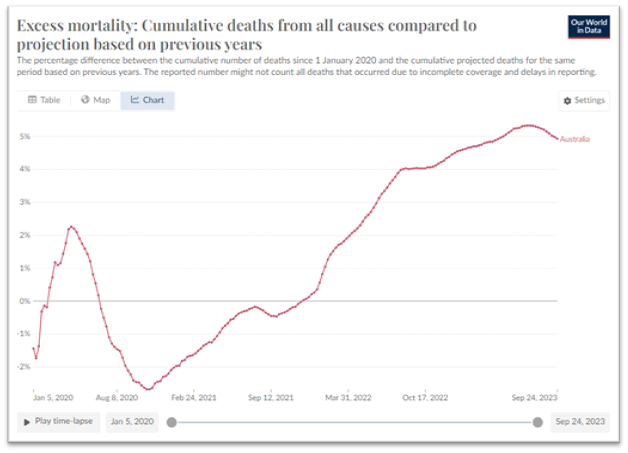
And as a percentage it shows:
I’m not actually sure a percentage of cumulative excess makes sense. I suppose it’s showing 31,000 divided by about 170,000 for a normal year. It means a total of 5% of the annual mortality has occurred in excess of what we expect. But the different shape in the previous years implies for that year they use a different denominator. I think this is not a very useful metric.
I also found this version (metric: excess mortality estimates) which also shows COVID deaths on the same graph.
It appears to have a different data source, the Economist. I clicked on the link and the references are there for this data. Another thing to follow through. The estimate goes to end of 2023 and shows excess of 35,000.
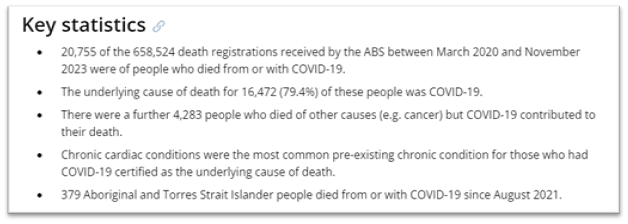
I note that the 24,000 number of COVID deaths includes all the “extra” COVID attributed deaths, The number is more realistically 16,000. The latest ABS COVID report till November 2023 is here.
COVID was the underlying cause of death for 16,472 people till the end of November 2023. There are 20,755 deaths “from or with”, so somehow an extra 4,000 is added. I learnt during my preparation for the Senate hearing that one of the ICD-10 codes for COVID requires a positive PCR test but not necessarily any symptoms of COVID! This is absurd. Another 4,000 died of other causes, often cancer and who must have had a positive PCR test. Close investigation of the COVID deaths is warranted. That is outlined in Reference V of the People’s Terms of Reference.
ABS Mortality
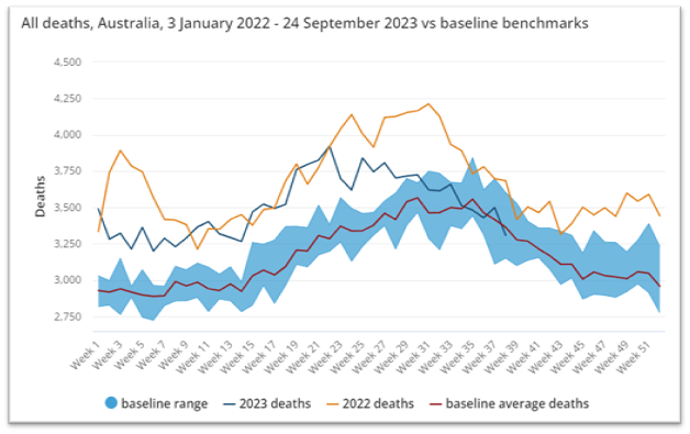
Looking now at the latest ABS Mortality Report, released on 20 December 2023, with data up to end of September 2023.
The dark blue line, for 2023, looks like it is going below the red baseline for the first time in 3 years.
Using this ABS data, from the most recent report to September 2023, I calculate the Cumulative Excess Mortality from 2021 onwards. I compare the ABS baseline with mortality over the 3 years (2021, 2022 and to Sep 2023) by subtraction to get the week-by-week excess. Then we sum the weekly excesses up for each year. I get:
I note that 2020 was lower than the baseline by 2,998, but that could be expected to be within the normal variation. It could be argued that we should subtract this. So, the estimate is 45,000 cumulative excess. Maybe 42,000 if 2020 is included.
In my recent article using a cumulative mortality method and a simple 2nd order fit I got the following for the cumulative excess mortality.
The cumulative excess is approximately 42,000. So fairly close agreement with the ABS estimate.
The fact that in the “normal years”, prior to March 2021, using this simple model shows a consistent variation above and below the zero line indicates we must have it close to correct. When I say a simple model, I mean we have not done too much fitting to try to track the data. A second order fit is basically a straight line with a little bit of a curve in it, either up or down depending on the trend.
Our friend Clare Pain has done a lot of work looking at the new ABS model (in her chapter of the AMPS Too Many Dead book publication and recent article here). This alternative ABS model uses cyclic regression, which I reproduced in this substack article. Using the alternative ABS model will give a different estimate of the cumulative excess. It’s curious that they felt the need to reach back further in years to 2013. We will have to look into this model to see what cumulative excess it predicts.
Age Differences
Now we know things are complicated with respect to the dynamics of mortality. We really should be calculating the excess over narrow age bands and then adding these together.
Joel Smalley did an excellent series of articles which took us through his workings to calculate excess for the UK. The articles are:
and a helpful answer to a question I posed in the comments.
He personally purchased data from the ONS in one year age bands. He did a clever thing where he tracked people by their year of birth which he could do with one year age data. When one is generating models, it makes sense that you group together data that is consistent. Doing that by age makes sense. We expect young people to be more similar with each other than old people. As Joel has done, people born in the same year will be similar in various ways. For example, in the older population they went through wars at the same stage of their life. As time has gone on, I have gained a better appreciation of these factors
However, it is still complicated. There are healthy robust people in their 80’s and there are people close to death.
By, the way Australia’s oldest person just recently passed away at age 111! She was a lady of Dutch origin. She looks fantastic in the recent photographs.
I tried to explain this to Senator Shoebridge at the hearing last week, when he asked us: How did we think “innumerable” studies of vaccine effectiveness could be wrong?
See the youtube of the proceedings with link set to 3h16m50s. The more I think about it, it was actually a very pertinent question. My answer included:
1. These studies won’t provide the raw data for scrutiny.
2. The studies are hopelessly confounded.
Comparing unvaccinated and vaccinated 80-year-olds as single groups is ridiculous. You need a randomised controlled trial where you would pair off healthy and not so healthy 80-year-olds. No such studies have ever been done.
OK so we don’t have 1 year age band data, and we don’t have other categorisations that would help, we “the People”, have to use what we’ve got. For Queensland I obtained data in 5 year age bands for that analysis. The aim of my study was to find the time where mortality started trended upwards, rather than compute estimates of the numbers. With the publicly available ABS data we have data in broad age bands
0-44
45-64
65-74
75-84
85 and over
Ages 0-44 Mortality
I’ll finish up with an analysis of the youngest age group, ages 0-44. I use the cumulative mortality method and fit a simple curve to the data pre-March 2021.
Looking closely, you can see the data from 2021 onwards, in the orange line, and it diverges from the extrapolation of the data prior to March 2021. Subtracting to get the computed cumulative excess:
We can see that the excess takes off from about October 2021. It reaches 700 excess deaths.
I went to the ABS data to find out how many COVID deaths there have been in this age band. I estimate it to be approximately 200. That data was available in 10-year age bands from the ABS and I had to estimate ages 40-44 by halving the 40-49 band.
So, while the absolute excess number is not huge it appears it could be 500 young people in excess, not COVID related, that have sadly passed away.
We also know that very, very few healthy people died from COVID in this age group. Many of the 200 would have had serious comorbidities. We got a sense of that from some of the NSW Health data before that reporting was pulled down.
I had to made a population adjustment for this data because in this age group the resident population in Australia actually decreased during the lockdown periods. Expats and overseas students returned home as well as there being no new students arriving. That highlights another consideration, the component of the population that varies, ie the visitors for work or study, are likely to be relatively healthy. We would not expect them to have serious comorbidities and therefore be less likely to die from COVID.
There’s so much more to unpack from this data but this article is long enough.
I trust it serves as a simple update of where we are up to. Apart from the Royal Commission, that is essential in Australia, there is an imperative before then to inquire further into the excess mortality currently being experienced in Australia, as it is in other Western countries.
In answer to the question posed in the title, we are not back to zero.


I remember that a lady killed by AstraZeneca was Jabbed in Australia but died soon after arriving in UK, and TGA did not want to include her in the Death count. Maybe someone can find that case?
Excess mortality in Australia is not back to zero. Youngest age-group seems to have normal deaths rates. Persons over 45 and above do not have normal death rates, and the oldest groups are still dying in excess.
With that much excess mortality since 2021, Australia should have had a large deficit (negative) mortality as the pull forward effect comes into play. Normal is still not normal!
Australia will change their baseline calculations for future reports, no doubt to hide excess deaths. https://open.substack.com/pub/supersally/p/australia-has-had-more-than-51000?r=l1r7e&utm_campaign=post&utm_medium=web