I previously wrote here about the Excess Mortality being seen in Australia across all ages. The Australian Bureau of Statistics (ABS) data includes a breakdown across age groups and in this article, I report on one age group, 65-74 years. These are the traditional first years of retirement.
In the previous article I showed the Excess Mortality, for all ages, with a worrying increasing trend from 2020 onwards. I showed it as a percentage increase on the baseline number of deaths. I also took into account COVID deaths so the Excess Mortality did not include the COVID deaths. It was running at about 10% higher than it should.
Another tranche of data recently came out from the Australian Bureau of Statistics covering February 2022.
The Excess Mortality in Australia is getting some minor coverage in the legacy media together with coverage of problems with shortages of workers in key sectors (eg health and education), partly due to people laid off due to mandates. Several Substack articles have covered Australia, in conjunction with excess mortality in other countries. See Alex Berenson’s post and it is worth looking at one of the comments (the top liked comment) by an estate lawyer in Australia noting the overload of work in that industry and delays in probate. Another by Joel Smalley where he makes interesting observations including the difference between males and females.
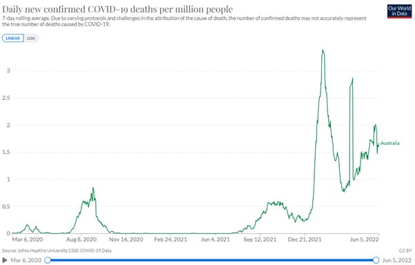
Australia is now high up in rates of death due to COVID. See below from Our World in Data for the last month.
This is in the tail of the Omicron wave. To put it in context, Australia is highlighted in the graph below for the whole Omicron period.
Interesting that hard locked down countries (Commonwealth countries: New Zealand, Australia, Canada) are high. The sudden jump in the graph above, around end March, is an artifact due to authorities adding an extra number of deaths. It remains high for 7 days due to the moving average used in this graph.
Australia missed the major COVID worldwide outbreaks, due to hard lockdowns, but the advent of the Omicron variant has had a bigger impact in Australia than many other countries. Daily deaths over the whole pandemic period are shown in the graph below.
The challenge I had with the analysis of Excess Mortality in age bands is the way the government reports data. In order to correct for COVID deaths for different age groups I needed the weekly number of deaths in age bands. This is not recorded in one location. The government health department page provides a daily update with COVID deaths in 10-year age bands. As at the end of February:
Total deaths in the 60-69 age band: 472, 70-79 age band: 1062.
Earlier at 26 December 2021:
Deaths for the 60-69 age band: 229, for 70-79 age band: 481. Taking the average of these age bands to estimate for the 65-74 age band, noting this will be an overestimate, we get 767-355=412 deaths from COVID. Over the 9-week period this is an average of 45 deaths per week on a baseline of expected number of all cause deaths of 488. Not large but significant. I adjusted appropriately to estimate deaths for each week over the Omicron period.
Age bands not matching up is one issue. Another is the annoying fact that there appears to be no formal way to get historical records of this data. The page gets updated daily. I had taken some screen captures myself over time and I also tried various web page archival services. However, a problem is that some of the web archive sites don’t capture images properly. This particular table and others on the page are images output from an analytics system. For example on the “Wayback Machine” the tables are not captured. I did find one archive site where I was able to get enough snapshots to make an estimate of the COVID deaths per week for the age band.
If any readers have suggestions where to find this age breakdown data of COVID deaths in Australia it would be much appreciated.
I did the correction from end of December 2021. Before that I am not correcting for the COVID deaths. However, the deaths in the 65-74 band are relatively small compared to the older ages where the COVID impact is worst.
The ABS provides age breakdown of deaths for 0-44, 45-64, 65-74, 75-84, 85+ age bands.
I looked at the younger ages and there were no obvious trends. This is probably because of the wide age range for the bands and there are probably different patterns happening in different age subgroups. The 65-74 band is the first 10-year age band where we would expect similar behaviour within the band. It’s an age where health, for some, starts deteriorating. It also should be the start of happy days after toiling at work for 40-50 years. The years making up the baseline deaths for this age band are fairly consistent from 2015-2019. It is cyclic, at its lowest in Summer and peaks in the Winter flu season.
The baseline total is approximately 25,000 deaths per year (ie 488 per week). It goes up and down a bit within the range of years making up the baseline. It was 26,113 in 2017 which was a bad flu season.
Weekly deaths in the age band 65-74 are shown in the graph below:
I show the baseline curve in orange in the 2019 year and in the graph I have also shifted it right to align with the 2021 year extending it to Jan, Feb 2022. I have fitted a moving average shown as dashed lines. The deaths for the pandemic years 2020 and 2021 are shown in blue.
2020 is weird. There are slightly more deaths in 2020 than the baseline, ie 26,237 vs 25,368. However, in 2021 the deaths are consistently above the baseline. This age band is clearly contributing to the overall Excess Mortality in Australia.
Looking into it further I plot the cumulative Excess Mortality. That means adding the excess week on week from some starting point. At the start of 2020 the deaths roughly match up with baseline deaths for our Summer (see the orange and blue dashed lines above at start of 2020 in graph above).
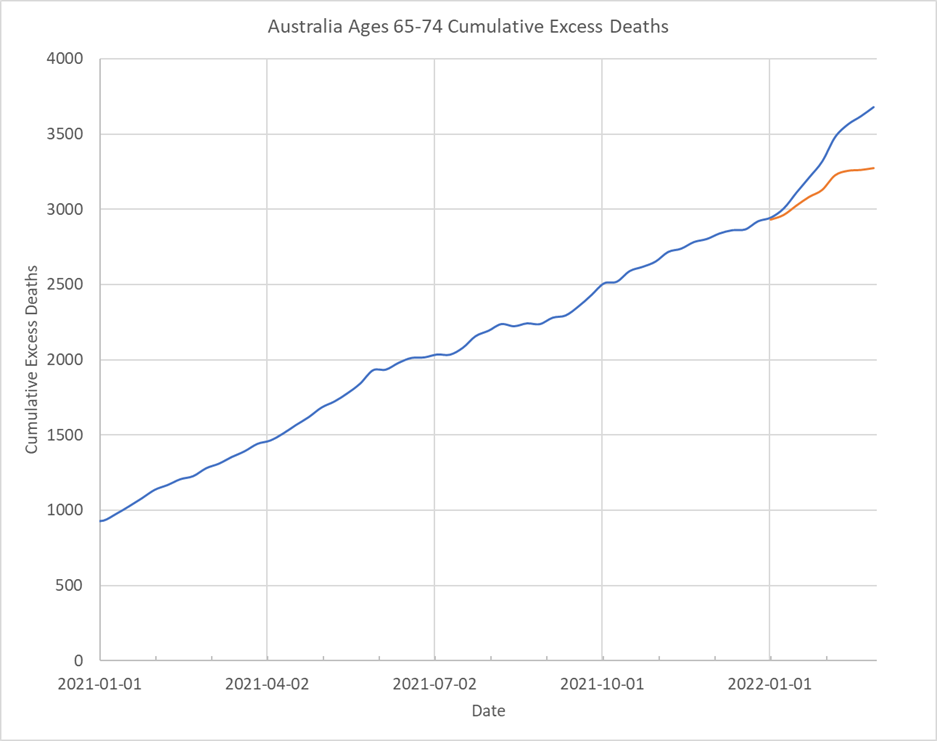
The cumulative Excess Deaths from Jan 2020 to Feb 2022 is shown below:
Ideally excess deaths with hover above and below zero, ie some weeks more deaths than average other weeks less deaths than average. I showed this in my previous article for the pre-pandemic years. Accumulating the excess should also track the zero line.
If there is a fixed increase in deaths, week to week, this will be a straight-line increasing right with time. If the increase stops then the cumulative curve will flatten out (this is seen above occurring mid 2020). In the graph above we see the line increasing with time, but turning up steeply, from 2021. It also has some lumps and bumps which may give some insight.
The Omicron wave in Australia officially started 15 December 2021. I show the correction to plot for Omicron deaths in this age group with the orange line at the end in the graph above. It adjusts the deaths down but the slope is still increasing. I have not adjusted prior to Omicron (there were a total of approximately 350 before this over the whole pandemic.
Looking at the second half of Cumulative Excess Deaths graph, ie from the start of 2021:
By putting a ruler to the plot you can see the trend of the line changing. We want to know if there are any sudden increases in the rate of excess deaths. This could be indicative of some intervention. We can plot the slope of this line to find this mathematically. The slope curve is below:
The first thing to notice is that it is always positive. Deaths are always increasing. The two largest bumps commence their ascent in April 2021 and December 2021. When the slope is 50 that means there is an increase of 50 extra people dying week on week. Adding the total of these increases is the total increase over a year. It’s over 2000 additional deaths and this is approximately 2.5 sigma above the expected number of deaths, based on the baseline.
I note that I based the calculation on the Excess Mortality after removing COVID deaths for the Omicron wave. So these Excess Deaths are not caused by COVID.
The bump in October may be caused by COVID deaths in the Delta wave which I have not corrected for (ie prior to Omicron). The deaths from this wave were much smaller in Australia than for Omicron.
What is the cause of these increases in excess deaths? There are likely many causes. This includes the health system being crippled by fear of COVID. People not getting diagnosis or treatments in a timely fashion. COVID has had an impact on this age band but it is far outweighed by other health issues.
The novel COVID medical interventions also need to be considered. Below is a graph of the vaccine roll-out in Australia:
First doses started in March 2021.
Boosters started in December 2021.
The spike around end December 2021 in the graph above is likely an artifact of injection centres being closed over the Christmas holiday period and the 7-day average. This was also a panic situation for some as job mandates were coming into effect at this point and some working age people were getting their first shots. The second major peak is mainly the Boosters and this would apply to the 65-74 age group.
Increases in rates of death coincide with timing of the introduction of medical interventions. Numbers are of the order of an extra 50 per week at the peaks.
In my post where I analysed deaths from the TGA Adverse Events database it can be seen that there are a significant number of deaths reported following vaccination in the age bands 60-69 and 70-79:
My interpretation is that there are several underlying issues being seen in this data, all due to failure of Public Health measures in Australia. This is unfortunately caused by blindly following a narrative, that it is too late to change, due to fear of repercussions to those responsible.
We have had the highest rate of COVID infections in the world and are getting close to the highest rate of death in the tail of the Omicron period. I have looked at the next age band and the effect is even more pronounced.
The median age of death in Australia is in the mid 80’s. It is very sad that those in early retirement years are suffering from this tragedy.


As a long suffering unvaccinated Victorian, October is when the no jab no job mandate came in force in Victoria. It was announced in September with a first dose deadline of 15 Oct and a second dose deadline of 26 Nov
Hi Andrew
As usual another great article. You may be able to get some of the age data from the web site below:
https://www.covid19data.com.au/deaths
Have a look at their adjustment and working spreadsheets. They were keeping track of pretty much every death in Australia line by line for a while and reconciling it against the official figures. May not be complete or “official” data set but may be of some use.
Thanks Ivo